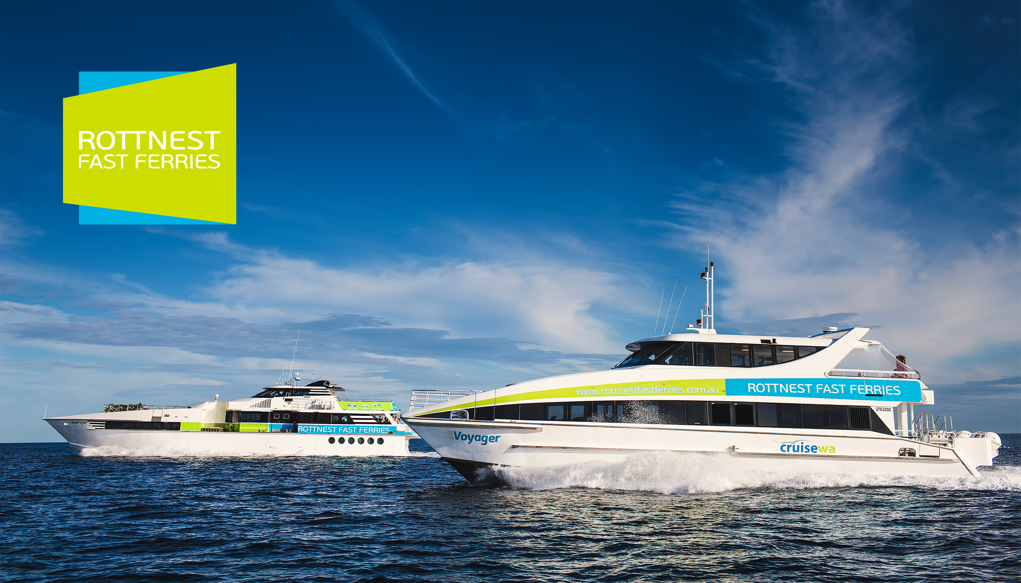
Rottnest Fast Ferries
Visualising Perth’s favourite offshore getaway destination
About the project
Rottnest Fast Ferries is a ferry transfer service between Rottnest Island and Hilary’s Boat Harbour. They offer a number of additional services including whale watching, twilight cruises and day accomodation package.
We were approached by the crew to re-design their entire brand identity. Rottnest Fast Ferries was looking to become more modern and dynamic in order to get an edge over the competition.
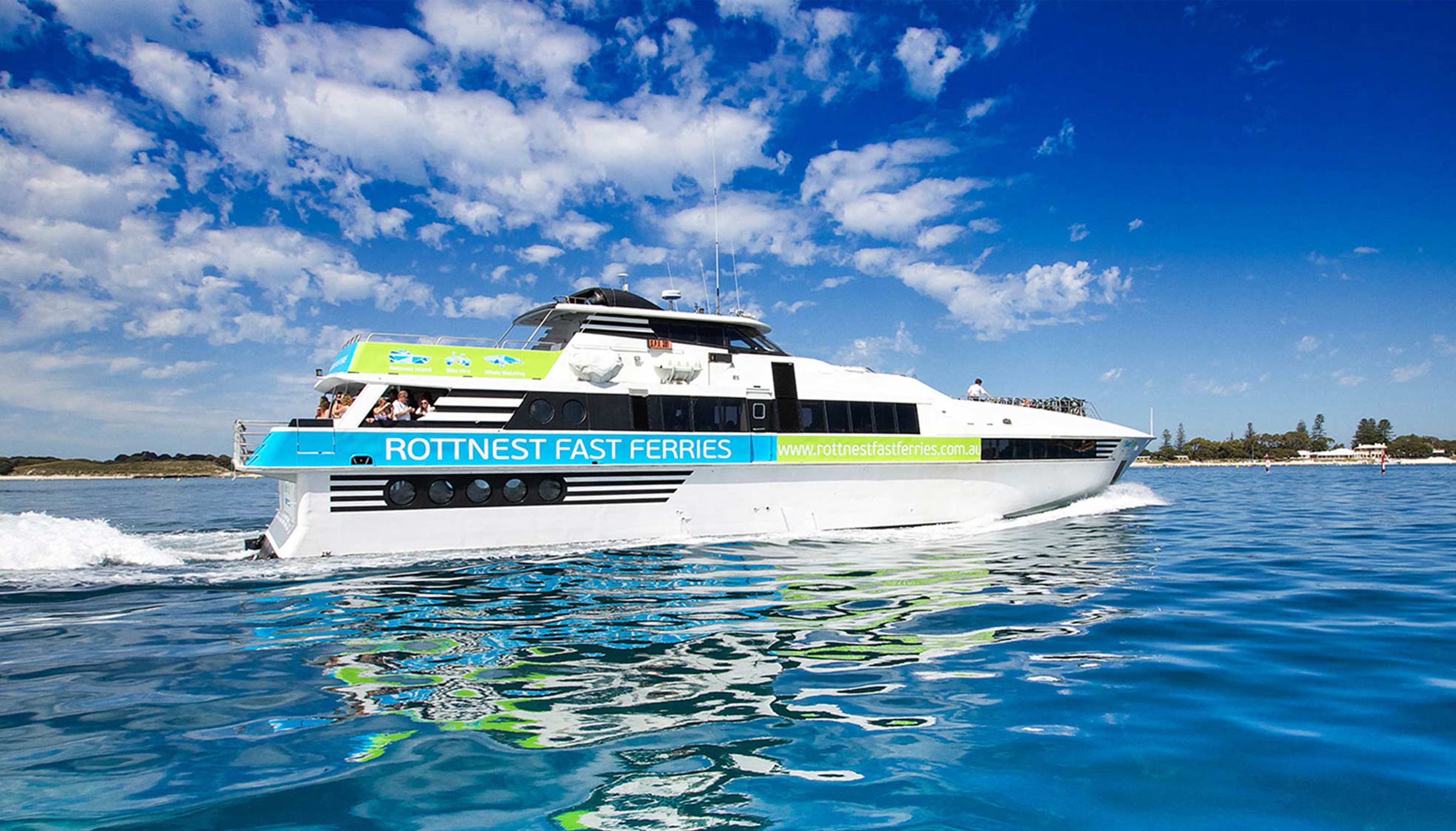
Visual identity
Pixel Whip began the project by selecting a brand new colour palette for the brand, aligning them with ideas of modernity and being dynamic. The two major colours selected were the lime green and light blue, which a highly eye catching numbers, destined to stand out in a crowd. By adding a modern logotype and dynamic shape, Rottnest Fast Ferries branding was well on its way to being modern and dynamic.
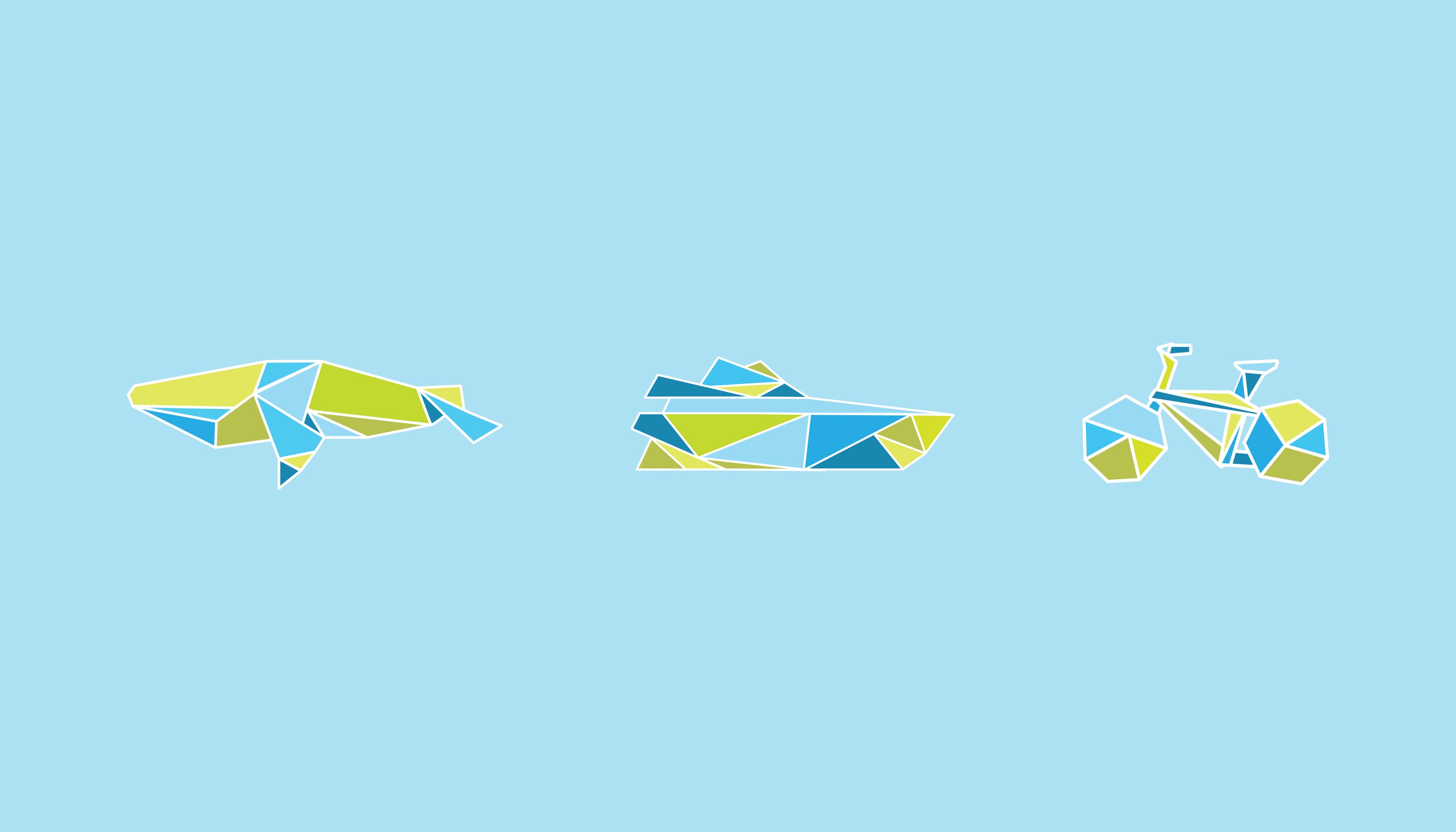
Iconography
Accompanying the logo was three symbols – a whale, a bike, and of course a boat. These three symbols to us signified what makes Rottnest Rottnest, and were clearly the best options to make. These symbols were used as secondary branding elements throughout the materials we designed.
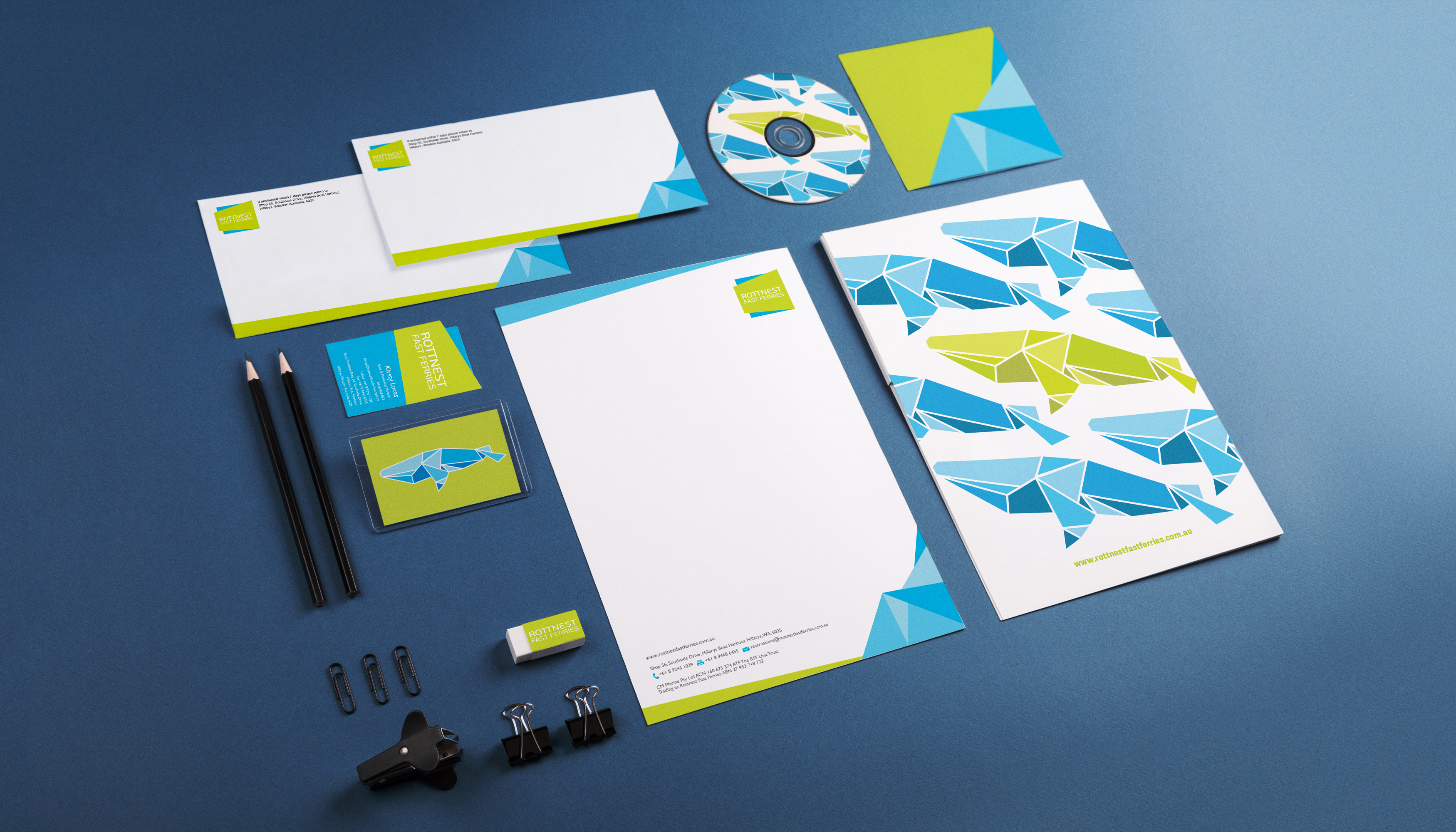
Finishing touches
After developing the initial brand identity the team was asked to produce all of the print collateral including: letterheads, business cards, ticketing stubs, vouchers, and presentation folders. These materials featured the selected brand colours and imagery, tying the elements together, ensuring the presentation of the brands values throughout all their marketing and print collateral.
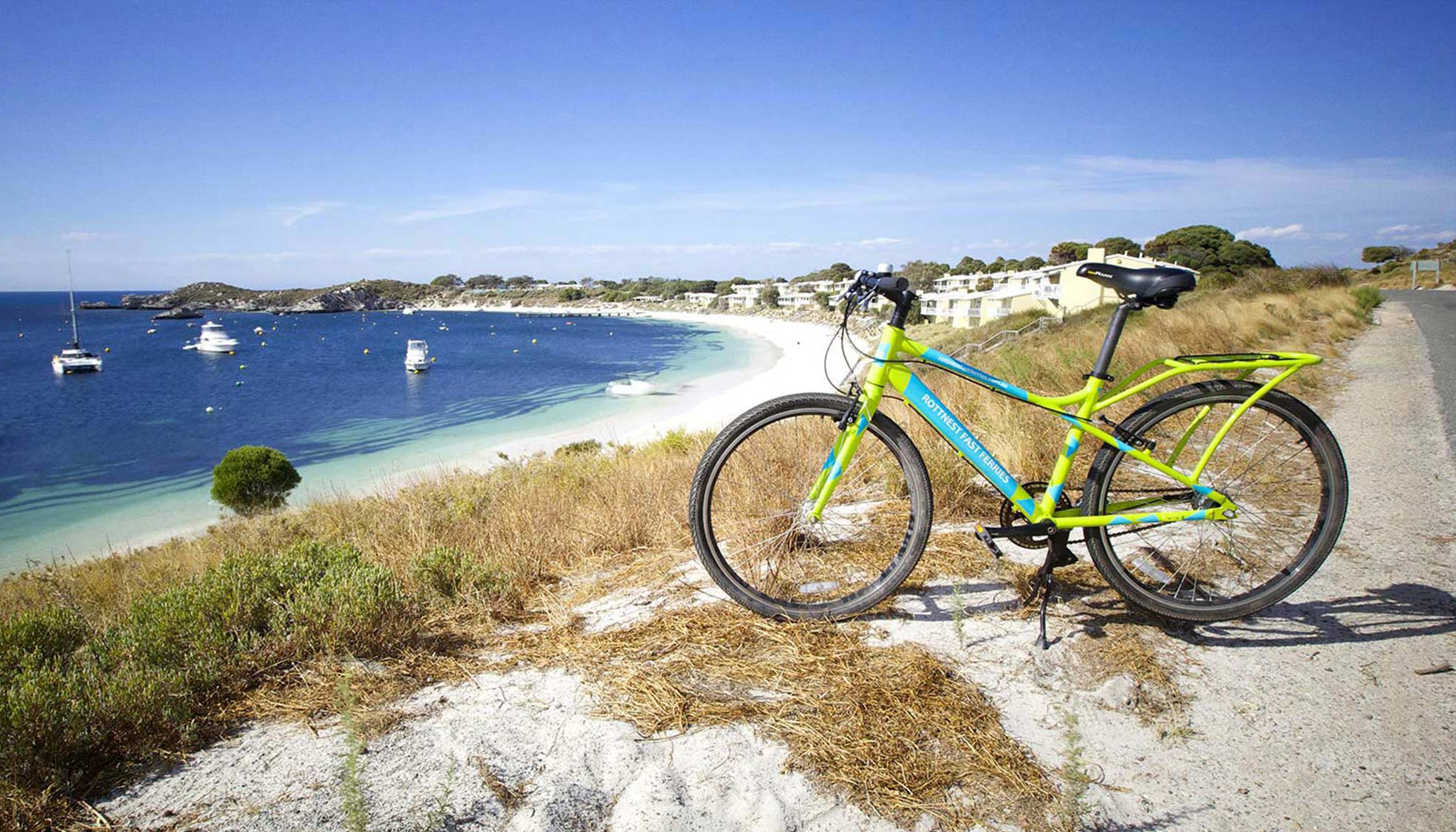
Further, we developed all the new uniforms for the staff to wear, as well as the bike and vehicle wrapping and boat signage.